
Libros
An inventory app for book lovers to find and track books
Project Overview
Challenge
Libros is an app for book lovers that will help users track everything they own, books they have read, what they will read next, and also everything they have loved so far. Libros wants to give a more user-centric approach to their app, adding features and flows that make it delightful for people to use.
Goals
The goal of this project is to design a mobile app that allows users to catalogue and track books, get recommendations and to stay updated with new releases.
Client: Libros
Timeline: November 2019, 4 weeks
Deliverables: Mobile prototype
Team: Self-directed, with feedback from mentor and peers
Role: UX/UI Designer
Tools: Sketch, InVision
My Process
Empathize
Process: Secondary Research, Primary Research, Research Synthesis
Market Research
I started the research phase with market research to learn about trends and needs in the book industry, then identifying competitors which helped me to understand the positioning of Libros within the market. From this research, I was able to identify potential target users.
Competitive Analysis
Next, I carried out a competitive analysis to determine potential competitors for Libros, their strengths and weaknesses. Through this analysis, I was able to determine how Libros competes with other competitors.
Competitive analysis
With the help of the research, I was able to create a provisional persona to determine the target users who read books in any format.
Provisional persona
User Research
Following the completion of secondary research, I referred to my provisional persona to determine appropriate participants. I started 1:1 user interviews with seven users to find out about their reading habits, how they find books to read and to catalogue them. After the interview, I reviewed each participant’s recording and created an empathy map to discover users’ insights and needs.
Empathy Map
To synthesis the results from user interviews, I organised each comment and quotes into different categories and gave a different colour to each user. From this empathy map, I was able to identify patterns in the comments and to discover insights and needs.
Empathy map
Insights
Users get book recommendations from friends & colleagues
Users often choose to read books by their favourite authors
Users have many books that they still wish to read
Users want to gain new knowledge and improve
Needs
Users need to keep track of book recommendations
Users need to be notified about new books by their favourite authors.
Users need to keep track of books to read next
Users need to find books that are insightful and inspiring
Persona
Next, I referred to the user research and created a persona (John) to use it as a guideline in the next phases of the design process.
Define & Ideate
Process: POV Statements & HMW Questions, Product Roadmap, Sitemap
POVs & HMWs
Based on the user insights and needs from the empathy map, I was able to define the problems and brainstorm solutions using POV statements and HMW questions.
POVs & HMWs
Product Roadmap
After defining the problems and brainstorming ideas, I made a product roadmap to priorities what features would be designed based on John’s needs and goals. I also included the metrics to evaluate what features are most and least required to be designed accordingly.
Sitemap
Next, I created a sitemap using the listed features from the product roadmap to show the app’s hierarchy and where each feature fits into this hierarchy.
Interaction Design
Process: User Flows & Task Flows, Lo-fid Sketches, Mid-fid Wireframes
User Flows & Task Flows
To start the interaction design process, I prepared UI requirements and wrote down user tasks to determine what screens and features would be designed for the mid-fidelity wireframes. I then referred to the UI requirements and sketched user-flows and task flows using the listed tasks to determine different flows that users might take to complete each task.
From user flows and task flows I was able to discover how users navigate through the screens, and what screens need to be designed.
User Flows
Task Flows
Low Fidelity Sketches
Before creating mid-fidelity wireframes, I referred to user-flows and task flows to sketch the main screens using pencil and paper. These rapid sketches show the basic content and visuals of what will be designed in the next steps. After receiving some feedback, I made some changes in the layouts and features of some screens.
Low Fidelity sketches
Mid-Fidelity Wireframes
Next, I referred to the low fidelity sketches and started digitalising the wireframes in Sketch. During the process, I referenced to Apple’s iOS human interface guidelines and the iOS app pattern library to make sure all elements and features are consistent. These wireframes were created and prototyped for the usability test.
Mid Fidelity Wireframes
Prototype & Test
Process: Mid Fidelity Prototype & Usability Testing, Affinity map, Adjustment & Revision
Mid Fidelity Prototype & Usability Testing
For the usability testing, I started prototyping the mid-wireframes in InVision. Before usability testing, I created a usability testing plan to lists out the tasks to ask from the participants. I ran the usability tests with 6 participants to observe how participants interact with the features and to discover areas of confusions and pains while completing the tasks.
After carrying out in person usability testing, I also made an online test in Maze to get more results. The report of my work can be found here.
The benefit of a usability test at this step is that users are being tested without being distracted with colours and images and the focus of test will be user experience.
Test objectives
To observe how participants complete the tasks.
To find out if the new features are simple and easy to use.
Identifying user frustrations and confusions in any steps.
User Tasks
Log in to the app.
Check what you have in your library.
Find the Sapiens book and tag book as “To read”.
Follow the author and set an alert for the new releases.
Affinity Map
After the usability testing, I reviewed the users feedback to determine patterns and organised the results through the affinity map. Affinity map helped me to synthesis the results and derive insights which would help me to improve the design further.
Affinity map
Insights
Users found the sign-in process confusing
Users struggled to find authors
Users struggled to search for the book
Recommendations
Make the sign-in process more clear
Considering combine the author page with book screen to make it more visible
Making the search process more smoothly and considering adding a filter in the search result.
Mid Fidelity Prototype & Revision
Next, I made revisions to the mid-fidelity wireframes based on the results from the affinity map and refined some contents to improve user experience. I updated the prototype screens in InVision before applying the UI elements. Feel free to check out the prototype built with the revised mid-fidelity wireframe screens.
I referred to insights and recommendations from the affinity map and made some changes to the log-in and book information screens.
Mid fidelity iteration
User Interface Design
Process: Style Tile & Branding, High Fidelity Wireframes & Prototype, Iteration
Style Tile & Branding
To begin with the UI design phase, I created a mood board in Pinterest and created different boards to get inspirations for branding, typography and colour palette. I gathered all the UI elements and created a style guide for Libros. I chose orange-pink as a branding colour and Kashmir blue as a complementary colour.
For logo and wordmark, I started sketching with pencil and paper, and digitalise my final logo in Sketch.
Style Tile
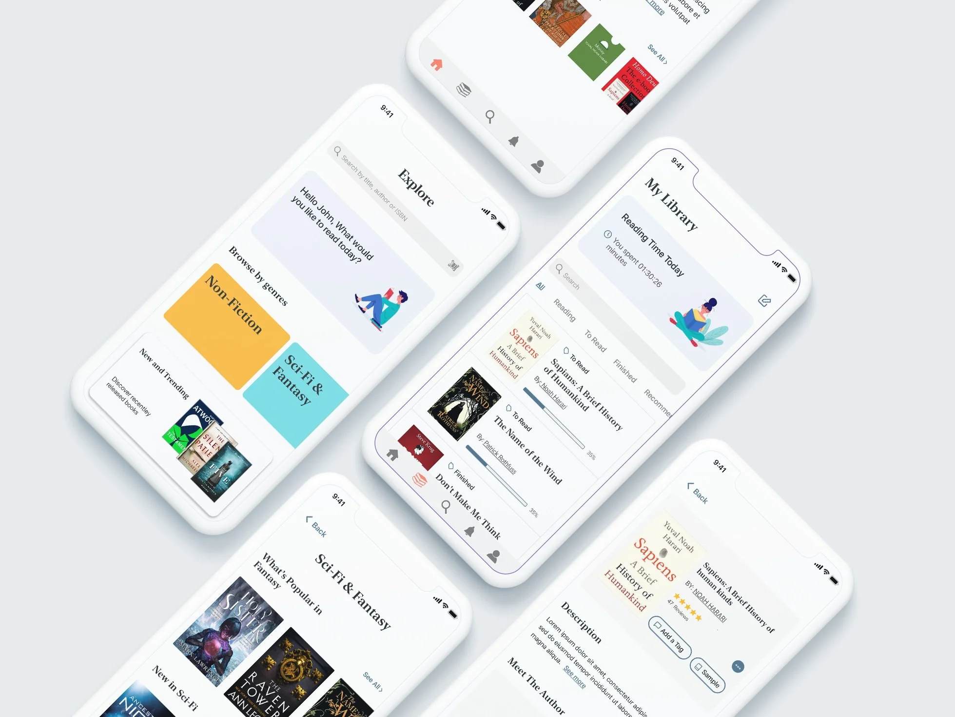
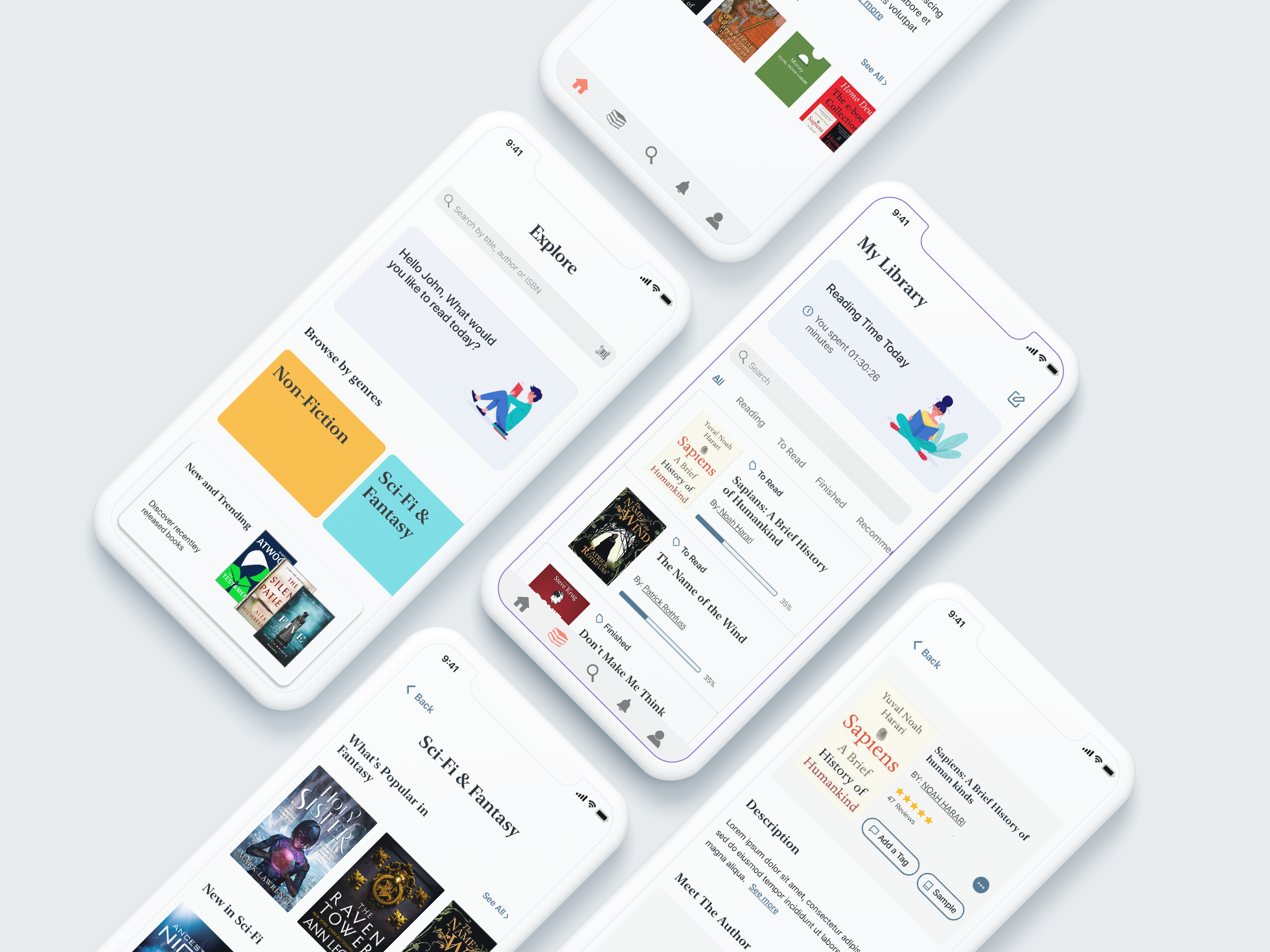
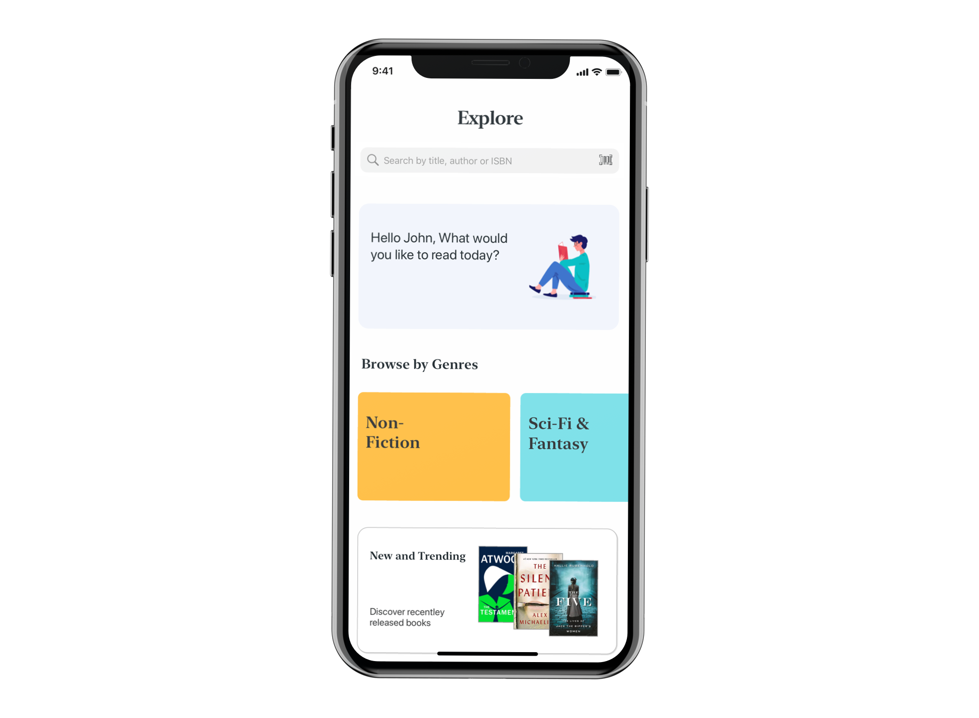
High Fidelity Wireframes & Prototype
Next,I referred to the style tile and applied the visual elements to the revised mid-fidelity wireframes. After receiving some feedback I continued iterating the wireframes and prototyped in InVision.
High Fidelity wireframes
Feel free to check the final prototype.
Reflections
For this project, it was important how the layouts and features are consistent with iOS design guidelines and it was a good opportunity for me to learn how to design for a mobile application. Other challenging but fun part was to choose a logo and branding for Libros; This exercise allowed me to practice with the pen tool in Sketch while working on the logo. I also had an opportunity to further improve my skills in user interviews and usability testing.
Future Steps
To do another round of usability tests to make sure the overall user experience is simple and intuitive.
To continue iterating through user feedback
To work more on the UI and branding part